The fast evolution from local agriculture to food industry created a mismatch between the production behind most supermarket products and the food narratives embedded in western cultures. Accessibility to remote or non-seasonal products elonged the supplier chain up to a level were production and consumption are almost disconnected. This gap created an opportunity for companies to create narratives around the products to reinforce branding as a competitive tool, and consumer demand for authenticity urged design to counterbalance that with hyperreal material narratives that are now possible with the current advanced printing technologies.
This article identifies four categories of material simulations and examines how they are used as a communication tool. The relationship between brand narratives and product attributes is analysed using Jean Baudrillard’s four stages of simulacrum, and lastly, the relationship between actual and simulated materials is explored using Boris Groys concept of media sincerity.
Keywords: material, simulation, hyperreality, packaging, branding, authenticity, media sincerity.
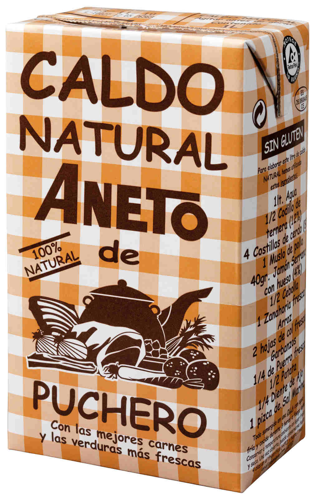
Shopping at the supermarket I am striked by a soup broth. The packaging features the iconic tablecloth pattern as a background that covers all the sides of the Tetra Brik. Inevitably, the pattern reminds me of my grandparents and all the times I had lunch at their home as a student. The product does not have a creative naming, just a plain description including a vernacular Spanish word for home soup (“puchero”) and “natural”, the only word that appears twice in the frontal. The logotype looks clunky, the illustration looks like a cookbook from the 70s and the only font used is the popular and controversial Comic Sans. The layout is messy and fails to follow any basic criteria of what good design should be.
Material simulation can be found on multiple products, like furniture or user interface design, that has been largely discussed in the past years. Why is it so common to find simulated materials in the supermarket? Wood and linen, silver and gold, rugged cardboard and old engravings are extensively used. What kind of messages are they conveying and what is their connection with the products they are attached to? This article will focus on food packaging design and aims to clarify the communication role of this simulations, looking at the social context where they flourish and using the concepts of hyperreality and media sincerity from the philosophers Jean Baudrillard and Boris Groys respectively.
1. Materials and brand narratives
During the 20th century there has been a radical evolution in the way we produce, buy, cook, and eat food. From local agriculture to large multinational companies, from rooted tradition to flashy cuisine innovation, from homemade to home delivery, from a duty to a hobby, and form slow oven cooking to a quick microwave ping and to ready-to-eat products.
This changes occurred in such a short period of time that our habits and notions about food don’t exactly match. Along with this social changes, food production turned into a regular industry: global, complex and competitive. Brands must therefore meet demanding requirements about price, food conservation, transportation and legal obligations. The same requirements apply both to products and packaging. This scenario leave and narrow space for packaging designers, that also need to follow marketing briefs, with specific brand values and product descriptions. Every new product launch is an investment, and those who don’t achieve success in the few weeks quickly disappear.
This pragmatic and economic vision completely clashes with the traditional notion of food we inherited as part of our culture. The supermarket is filled with references about tradition, nature and history. As a society we got used to the comfort and convenience of industrial food products but we are reluctant to accept explicitly the system that makes this happen. We need products that last but don’t like conservatives, we like fruit from the other side of the globe but don't like to see the food process needed for such a long trip. We want no lowest prices but are not willing to accept the poor labour conditions they imply. The more steel tank in the industry the more rustic wood in the pack. Instead of low-wage workers we like to see a charming smiley grandfather.
The complexities of the food industry logistics created a deep divide between producing and consuming, products now follow through a complex chain of suppliers that makes very difficult for the consumer to remain connected with the origin of the food, something that happeded spontaneously in rural lifestyle. Living in the city makes this task even more difficult. This divide between the produce and consumer creates a huge space for the brands to make beautiful promises about nature and quality. And it’s in this point where materials simulations become handy, they are used as a tool to cover the industry with fairytales. Stories we are told in advertising, stories we like and got used to. They fill our pantry. Maybe neither the brands nor the citizens were very interested on unveiling the fairytales wrapping industrial products. What kind of narrative is told and by which materials?
To analyse the myriad of simulations we can found in the supermarket we identified four common material simulations. Each of them helps us to illustrate one communication concept.
1.1 Wood and cardboard
The origin of wood and cardboard is not the same, since wood is a material present in the nature and cardboard is manufactured. But their connotations and the way they are used are similar. Both materials evoke a rustic atmosphere and emphasise the natural and raw feeling, and are not treated as an object but as a background texture, usually covering large parts of the pack. Because of its fine grain and light colour the cardboard texture allows greater legibility of texts with no need to modify its original colour. Considering that some packs are actually made of this material the simulated cardboard printed over the real cardboard can be extremely realistic, because the appearance and the flexibility touch match. This texture is common in eco and healthy products, where the concepts of natural and raw are more relevant. These concepts are also relevant in fruits and vegetables in general. The narrative is then based on the purity, the lack of human intervention and ultimately the lack of comercial effort. If glossy paper is the material of brochures and commerce the cardboard becomes, by opposition, the icon of authenticity. Looking at the packs that illustrate this group the idea of non-designed pack may seem unconvincing, the packaging is obviously carefully designed but the story makes his way into the supermarket, at least until it becomes a standard.
1.2 Tablecloth
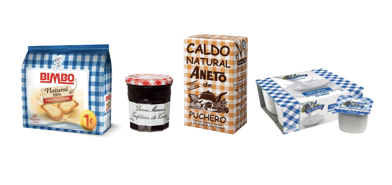
As in the wood is used as a texture. This motif relates to powerful concepts like home tradition or family, and its derivatives like picnic, homemade or conserves. The four examples belong to four different products: bread, confiture, broth and yogurts. The yogurt is a peculiar case: the company La Fageda was born to employ people with a mental condition, is small and it's clearly local (the name comes from a Catalonia region). If the story behind large-scale factories it’s not particularly appealing in this case the brand does have a nice story, but even so transparency seems not to be an option. Since all the products are human made the narrative here cannot be the purity of the wood but the care they were produced with. If the factory it’s not the icon of care, then the grandma-meal tablecloth and the homey kitchen is seen as the refugee of caring production, as the ancient artisan workshop of food.
1.3 Metals
The metals are another of the simulated materials used to transfer their aesthetic values to the product. The shining quality inherent to the metallic materials like (aluminium cans or metal-coated paper) make it easier to simulate gold. Carton packs need to use printed glare effects that lack the metallic touch. The most realistic technology over carton is gold stamping, which actually contains metallic particles (usually bronze, aluminium, copper and zinc), but that implies increasing the cost and its environmental impact.
Gold is, above all the other materials mentioned, the most symbolic. We can appreciate that the name of the material is part of the product naming, something difficult to imagine with any other material. Significantly, gold is not present in any basic nutritional food (not even the top quality bred would use gold) but in expensive or pleasure products, food that needs to persuade with reasons other than health or energy.
The values carried with the material refer to quality (as a certification), social prestige and status (referring to hierarchy and marking the product as the top choice). Silver is sometimes used as a sign of a high-tech product, but gold it’s not the top because of newness but because of unquestionable and classic quality, a safe and reaffirming choice.
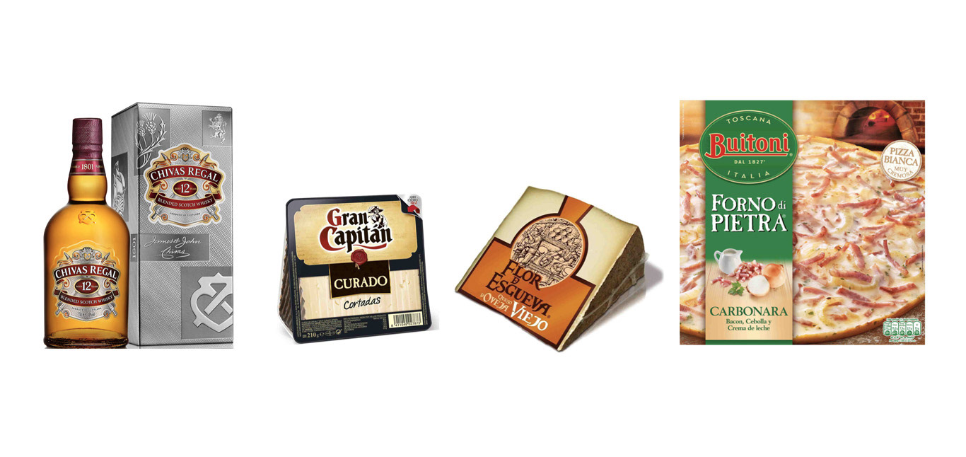
1.4 Ink and engravings
As the last group we want to include an element that is both material and a typographic style, all the forms of writing and type setting using a historic tool or material in a very expressive manner. Here the material is just underneath the word, but – as the examples prove – the visual representation of the material is celebrated as much as the text meaning, if not more. What visual element is more efficient bringing the history to the viewer, text or font-material? Its historic connotations make it appropriate for products with ancient recipes, where the older the food the better. That is the case of wines and liquors, but also cheese or pizza. If in gold the quality was a question of price and status, the narrative here it’s that the product is good because remained intact, the age acts as an argument for quality. It’s the narrative of the the essence: the pizza is good because its is the original pizza, cooked in the old way, the way that identifies us. It’s really about the notion of a pure identity.
2. Relationships between material narratives and product attributes
Underlying the values mentioned (tradition, nature, prestige, history, etc.) we can identify the seek for authenticity. The abuse of this concept it’s a tacit confession that after so many simulations in our lives we are no longer sure we can call it reality with capital R. The messages delivered by the packaging examples analysed can be interpreted as a lack of collective self-esteem, or at least a certain discomfort the age we are living.
The sense that when it comes to food old times used to be better has pushed packaging design to project of our ideals into the past and recreate a mythical tradition that may not have actually existed. This idea of false recreation was formulated by the french philosopher Jean Baudrillard, who coined the term hyperreality, defined as the simulation of something that never existed. In his book Simulacra and Simulation (1981) Baudrillard establishes four stages of simulacrum:
1. The simulacrum is a “reflection of a profound reality”
2. The simulacrum “masks and denatures” an obscure reality
3. The simulacrum masks the lack of a deeper reality
4. The simulacrum has no relationship to any reality, becomes its own simulation
If we apply these four stages to the simulacrum materials and the narratives they enact we could rewrite the stages to evaluate the relation of the material with product, regarding not only the food it contains but also aspects like geographical origin, production process or nutritional benefits. The stage one would be packs where the material narrative is a faithful presentation of the product, where the material openly reveals the production process of the food and production materials used in the packaging.
Hiperreality does not only rely on what design elements are used (e.g., materials, images or fonts) but also in the way they are being used and the role they play in the narrative. Overacting, for example, is a very common sign of hiperreality in design. Pushing the visual signs too far reveals the effort in conveying certain aesthetic values and the communication strategy behind. The hiperreality may be effective and appreciated by some easy-going consumers but may also be a flaw to a more visually literate consumer, who might then realise the backstage of the packaging.
To illustrate each stage we use a product as an example, but the analysis model could be applied in multiple ways, a single brand can be at different stages depending on the product analysed. The lines between stages can be fuzzy and could be seen as degrees of fidelity between the material narrative and the product, the upper the stage the more inconsistent is the narrative from the product attributes, and therefore more autonomous.
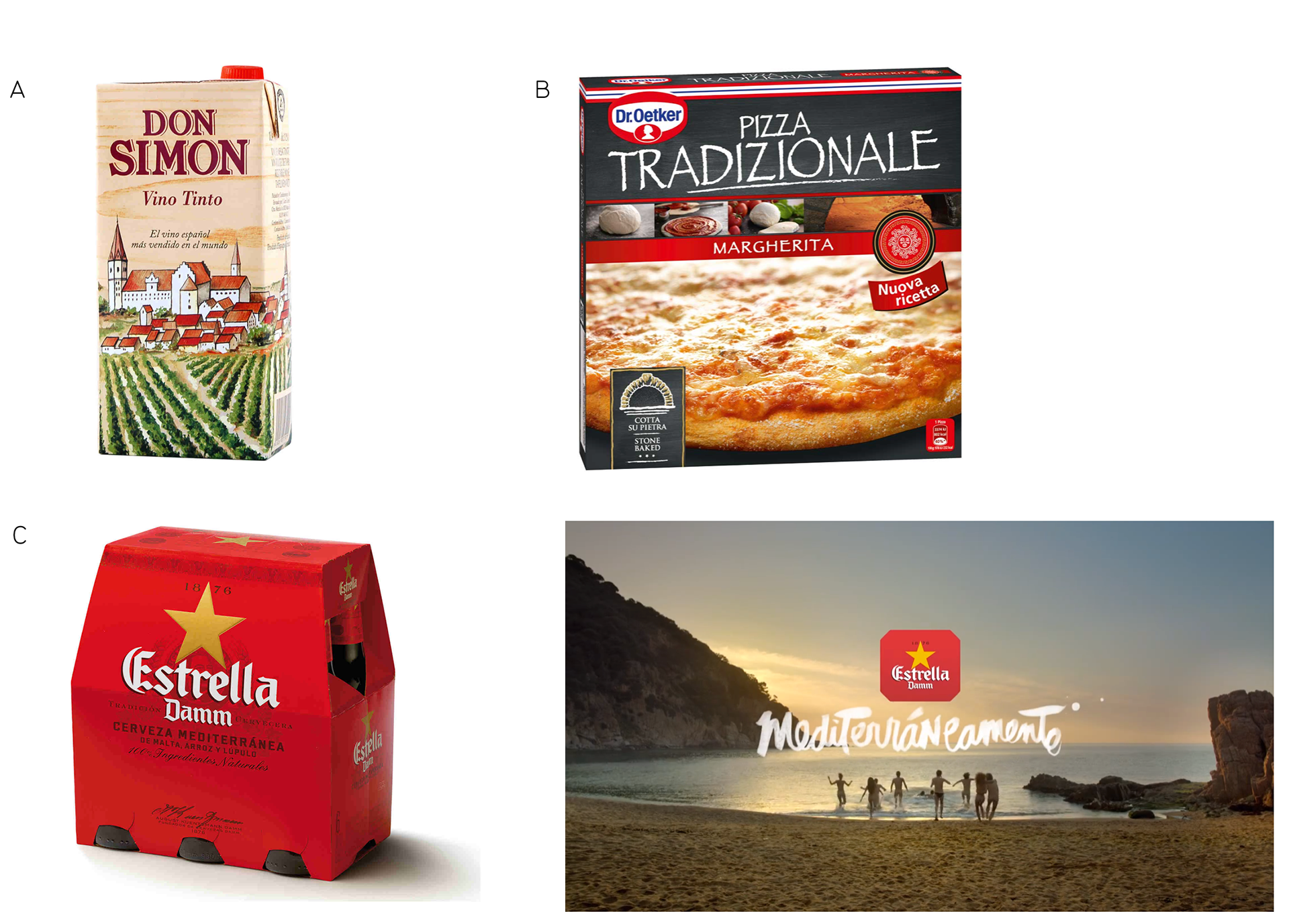
Fig 2.1. Examples of simulacrum in packaging design
Stage 2. The material narrative enhance some qualities of the product and hide some of its flaws.
An example could be the Don Simon wine Tetra Brik printed with wood (image A). Wine really uses natural ingredients (even the low-range product like this one) so the natural origin is not masking the product. But using a plastic container in the wine sector sets the product far away from the wine culture, and therefore needs to actively repair the mismatch between the plastic and wine narrative, even at the price of appearing ostensibly fake. Regarding the illustration, the naive village featured would be more suitable to the third stage, the narrative moves one step further away from the production of the product.
Stage 3. The material narrative masks fundamental aspects of the product, the communication values compete side by side with the product values.
The cardboard packaging used in many frozen pizzas (image B) does not support any printed simulacrum material, the actual material is available by touch and can be seen without printed images in the interior while interacting with the packaging. Nevertheless because the material is covered with a printed photograph it does not reveal the material upfront, it’s not enhanced and definitively not part of the narrative, which is led by the ink effect on the product name.
The Dr. Oetker is a well-known brand and started selling pizzas in 1970’s. The product is competitive, but it has a major flaw: it’s a German product with a very non-italian brand name. Instead of proudly adapt the pizza to the German culture like Pizza Hut did in the USA, the brand is using the original Italian narrative and imagery. The chalk material goes hand in hand with a handwriting font that is not actually handwritten but a digital font. Significantly all the text in the front is in Italian, while Buitoni uses also local languages. By pursuing the Italian essence Dr. Oetker does not own the communication became even more Italian than the original, which is exactly what hyperreality is about.
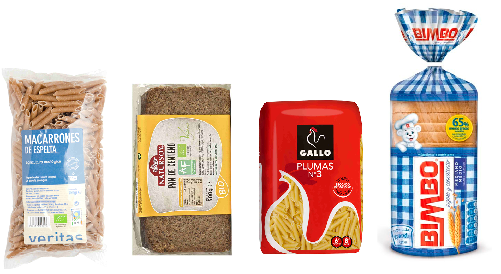
Fig 2.2 Pasta and bread comparison from bio and regular brands
Stage 4. The material narrative is not based on any product attribute, the communication is emancipated from the product.
The brand narrative is the goal and uses the product as a medium. A powerful and popular example of this stage is the Spanish beer brand Estrella Damm and the annual big campaign promoting a so-called mediterranean lifestyle (“Mediterràniament”) with unforgettable summer party nights. The spot (images C) pretends to be the trailer of a movie with celebrity actors, prestigious directors and title sequences, but there is no actual movie. Again, the trailer is a great packaging to a non-existing movie. Significantly many media announce the campaign launch – not as advertising but in the news section – as the beginning of the summer. Advertising dressed as popular culture. After the launch the brand sponsors numerous concerts (similar to the featured in the ad), serves the product and invites people to publish summer images on social media with the campaign hashtag (#mediterraniament). That is, including themselves in the narrative and act as an ad media to their followers. According to some critics consuming the product surrounded by all this messages and sponsored events is a consumerism equivalent of eating the Eucharistic wafer, it’s a meaningful act, one of identity and belonging.
* * *
Below all these layers of meaning remains a product that could be easily confused with other brands in a blind test. But bars don’t serve blind beers. As product differentiation has become a harsh battleground for brands the focus has shifted to communication and brand narratives. Marketing budgets are bigger than product innovation (10 times bigger according to Gartner 2014), and the product never competes alone in the shelf, big brands developed an army of communication tools to defend wrap the food with narratives that come to be inextricable from the food. Or as Baudrillard might suggest, they become the product.
According to the philosopher brands have the need to create narratives and sense of belonging in order to survive: Basically, what goes for commodities also goes for meaning. For a long time capital only had to produce goods; consumption ran by itself. Today it is necessary to produce consumers, to produce demand, and this production is infinitely more costly than that of goods […]. For a long time it was enough for power to produce meaning (political, ideological, cultural, sexual), and the demand followed; it absorbed supply and still surpassed it. Meaning was in short supply, and all the revolutionaries offered themselves to produce still more. Today, everything has changed: no longer is meaning in short supply, it is produced everywhere, in ever increasing quantities - it is demand which is weakening. And it is the production of this demand for meaning which has become crucial for the system. Without this demand for, without this susceptibility to, without this minimal par- ticipation in meaning, power is nothing but an empty simulacrum and an isolated effect of perspective. (Baudrillard, 1983:27)
Packaging prioritises messages over product and thus, printed media over transparent packaging that yield to the food. To describe this interface between the product and the consumer the design Guy Julier (2014) uses the term mediation, a powerful tool to control the view of the consumer.
Another reason to cover the food is that some industrial products might not have a pleasant appearance by themselves, specially if compared to fresh or less processed food. Moving packaged food to a transparent container leaves the food alone, disables the mediation and causes important changes in its perception. In contrast to supermarkets organic food stores provide more examples of minimal transparent packaging (image 6), along with more detailed product information and less brand narratives attached to the product. The different packaging approach could be related with the product: when the origin and production are good news being transparent is a competitive advantage. And viceversa, when the story behind the product is bad or boring news (complexity and cold efficiency are not charming) the communication strategy moves the consumer attention to a brand new narrative, not created by the product but over the product, they are not organic extension of the product but overlapped on it. The lack of factual link between the product attributes and the brand narrative increases the demand of authenticity and urges the design to counterbalance that void with hyperreal material narratives.
Why do those narratives survive rational thinking? Returning to the tablecloth texture mentioned earlier, it is clear that the packaging uses the material simulacrum only as a communication sign, not to cheat anyone. The consumer can notice the actual material: no matter how realistic the tablecloth is printed the plastic touch of the tetra brick or the shining metal cap leave no space for confusion. But nevertheless the tablecloth is effectively communicating the values and brand narratives, because simulacra found in packaging does not aim to convince rationally but to work at a subconscious level. The same applies to all the examples shown, the consumer knows that the supermarket confiture is not homemade, but senses the homemade aura anyway.
This normalisation of the absurd is also present in Baudrillard (1983: 10), the author argues that the masses are reluctant to rational thinking, they prefer the meaningless use of signs rather than meaning and sense:
[…] the masses scandalously resist this im- perative of rational communication. They are given meaning: they want spectacle. No effort has been able to convert them to the seriousness of the content, nor even to the seriousness of the code. Messages are given to them, they only want some sign, they idolise the play of signs and stereotypes, they idolise any content so long as it resolves itself into a spectacular sequence. What they reject is the “dialectic” of meaning. Nor is anything served by alleging that they are mystified.
According to the French philosopher hyperreality end up blurring the boundaries between reality and simulation, deleting opposite concepts and the possibility of a logical discourse, resulting in a confusing amass of signs that allows no intelligibility or critical perspective (1978:21):
Everything changes with the device of simulation. In the couple “silent majority / survey” for example, there is no longer any pole nor any dif- ferential term, hence no electricity of the social either: it is short-circuited by the confusing of poles, in a total circularity of signalling (exactly as is the case with molecular communication and with the substance it informs in DNA and the genetic code). This is the ideal form of simula- tion: collapse of poles, orbital circulation of models.
This state of confusion – a sort of “meaning nihilism”– is the ground of hyperreal packaging materials. When we get used to see traditional and handmade narratives in industrial products these concepts no longer mean anything other than the simulation of themselves. Misusing and abusing of a word is a way of deactivating its power. The ultimate consequence of this scenario is that it’s harder to actually say something, it’s harder to take visual style seriously, to keep the ethics within the aesthetics. Everything is becomes a simulation game.
A speechless mass for every hollow spokesman without a past. Admirable conjunction, between those who have nothing to say, and the masses, who do not speak. Ominous emptines.s of all discourse. No hysteria or potential fascism, but simulation by precipitation of every lost referential. Black box of every referential, of every uncaptured meaning, of impossible history, of untraceable systems of representation, the mass is what remains when the social has been completely removed. (Baudrillard 1983:6)
3. Material sincerity
Just few years before Baudrillard wrote about simulation Victor Papanek (1972) criticised material simulacrum and stood up for a strictly honest use of materials, a faithful position that can also be overlooked as naive in the current supermarket age:
An honest use of materials, never making the material seem that which it is not, is good method. Materials and tools must be used optimally, never using one material where another can do the job less expensively and/or more efficiently. The steel beam in a house, painted a fake wood grain; the moulded plastic bottle designed to look like expensive blown glass; the 1967 New England cobbler’s bench reproduction (‘worm holes $1 extra’) dragged into a twentieth-century living room to provide dubious footing for Martini glass and ash tray: these are all perversions of materials, tools, and processes. (Papanek 1972:27)
He was critic with design being used to make products appear more expensive than they are, with either excessive packaging or simulated materials:
[…] packaging of perfumes, whisky decanters, games, toys, sporting goods, and the like. Designers develop these trivia professionally and are proud of the equally professional awards they receive for the fruits of such dedicated labour. Industry uses such ‘creative packaging’ […] in order to sell goods that may be shabby, worthless, or just low in cost, at grossly inflated prices to consumers. (1972:187)
What Papanek is asking for is the material to present itself as it is – be it the product or the packaging – a sort of material sincerity. The power of materials to efficiently communicate promoted the usage of insincere materials, where the actual materials remain silent serving as a medium to display the simulated material.
In the iconic book Understanding media Marshall McLuhan (1964) coined the famous sentence The medium is the message. McLuhan thought of media as a secondary message attached to the first message, the content. But while the content message was a conscious one, the medium message was unconscious, and thus a sincere one. McLuhan’s book aimed to move the focus to media and not only content, as he thought was usual at that time.
Fifty years later, the German contemporary philosopher Boris Groys (2000) suggests that innocent media sincerity is something of the past. According to Groys, media is no longer spontaneous and truthful but rather something to be suspicious about, as it may mask the actual truth underneath.
The packs mentioned earlier show the utterly conscious usage of actual and simulated materials in brand communication, along with the carefully planned communication strategy behind the product. As food companies became bigger and global competition grew, brand narratives and packaging design became increasingly planned, design proposals suffered more corporate meetings, and more approvals were needed to finally launch a new packaging. Adding steps and actors in the process results in a more engineered and controlled communication, a more politically correct tone of voice and, according to Groys (2000:52), a severe loss of freshness and credibility:
The impression of sincerity is weaker still if representatives of an institution or a culture keep singing the same old song, which is perceived as a fixed and well-known part of their identity. The same is true of texts, images, or films that are produced according to well-known conventions, because they merely confirm the expectations we already have of such cultural products. […] In our culture, sincerity does not stand in opposition to lying, but in opposition to automatism and routine. […] If we can detect no movement, no displacement, no disturbance on the medial surface, then the submedial subject appears to be completely still.
Groys argues that the only way of accessing the submedial truth is by an accident that reveals the interior: “a spontaneous deviation from the program, an interruption, a mistake, or, to put it differently, he hopes for the emergence of a different, strange, uncommon sign amid the usual routine. Precisely such a sign is then judged to offer an insight into the interior of the other.” (2000:53). Groys used the term media sincerity to describe this accident.
Over the past decades the technology in packaging industry has evolved and diversified the range of solutions and materials available, and the advanced printing machinery has reduce the space for media sincerity to the minimum, but nevertheless looking closer it’s possible to find cracks in the wall. The examples (Fig.3) show examples of media accidents, like mandatory numeric codes and printing errors. Both reveal the materials, technologies and industrial processes, and the commercial and legal frame they work within.
The codes visualise the industrial manufacture brands usually try to hide, and precisely because they work against the planned narrative we give them credibility, according to Groys (2000:50-53):
The exchange of the alien for the proper creates the impression of sincerity only when it incorporates those signs that arc commonly associated with the menial, the vulgar, the poor, the disagreeable, or the depressing. […] this insight into the interior of things also generates a feeling of trust within the observer. It creates the feeling that he finally knows what things really look like on the inside.
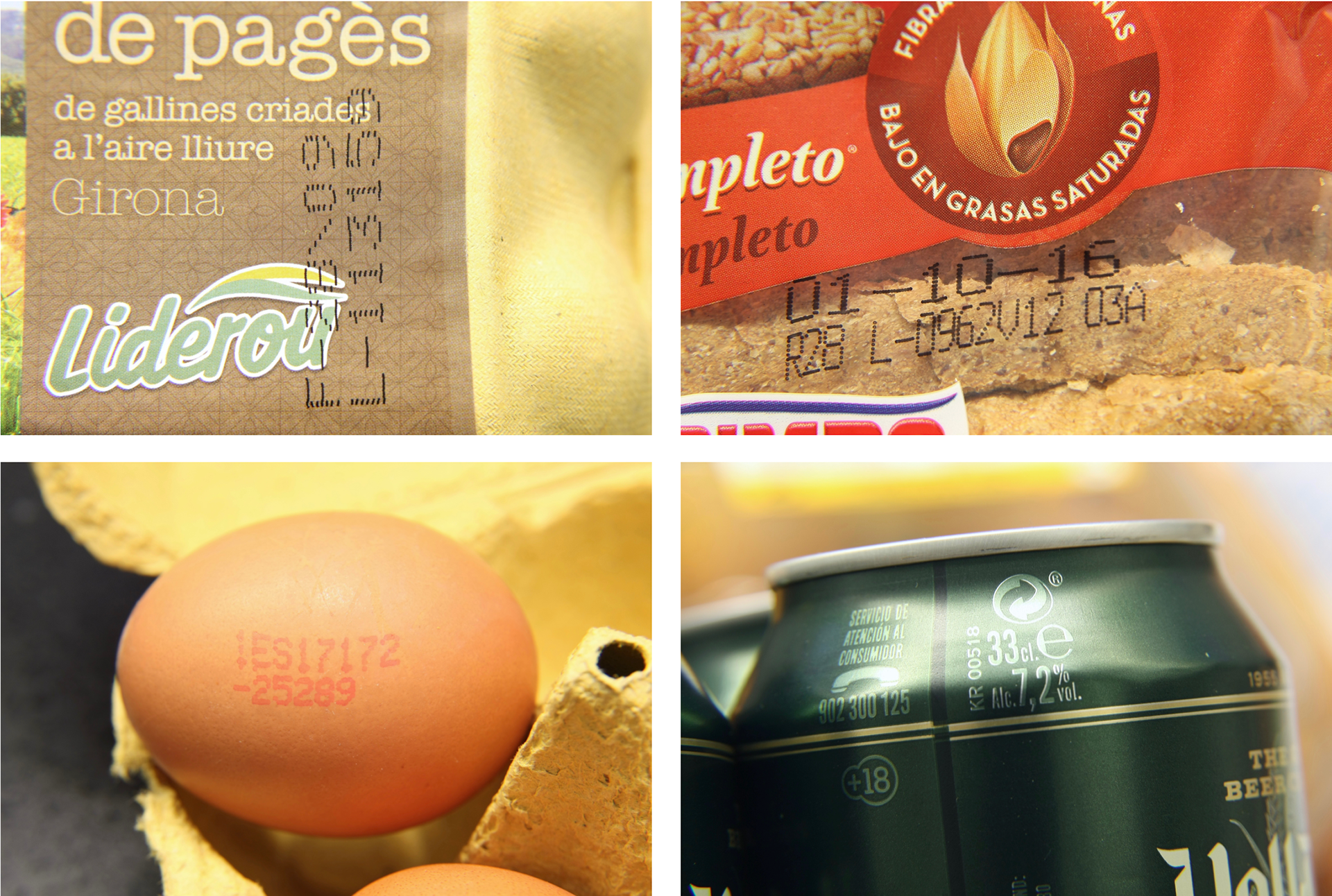
Fig 3. Examples of media sincerity: mandatory numeric codes and printing errors
To conclude, the several angles exposed in this article could be summed up in terms of distance: distance between producer and consumer, the distance between the product and communication, or the distance between what a material is and what appears to be. The current use of materials in packaging added many layers between the two sides of the pack. The ubiquitous Tetra Brik is a perfect symbol of this distance, between the food and the consumer there are as many as 6 layers of material: two made of polyethylene, one made of aluminium, a third one of polyethylene, one made of paperboard and a fourth one of polyethylene. Reducing the layers between the inside and the outside would not only reduce the environmental impact but also close the gap between production and consumption, and promoting a deep-rooted way of be in the world.
* * *
References:
Baudrillard, Jean. 1983. ‘In the Shadow of the Silent Majorities--or the End of the Social : And Other Essays’. Foreign Agents Series, 123 p.
Groys, Boris. 2012. Under Suspicion: A Phenomenology of Media. New York: Columbia University Press.